Hey hey! How are ya? I’ve been dealing with some computer problems this morning, hence the late post. I thought those weren’t supposed to happen on a Mac?? ;)
Anyhoo, the other day I caught the last few minutes of the HGTV dream house special and was pleasantly surprised with the bits I saw. Every year there are definitely parts I love and some I not-so-love. I found a little of both when I went to the site to see more of the house.
Have you seen it yet? I’d love to hear your thoughts too!
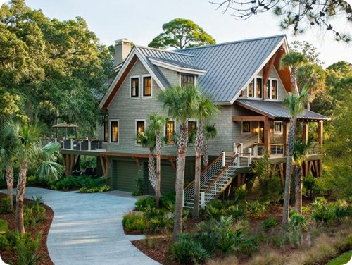
It’s absolutely beautiful from the outside, looks like a tree house to me:
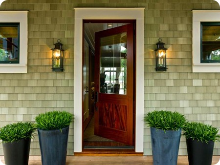
The front porch is amazing, and those shingles look like cedar but are really made of PVC:
Wild huh?
And you KNOW I love that front door with the glass! (We discussed the potential for glass in our front door in here – so many of you had opinions on that!)
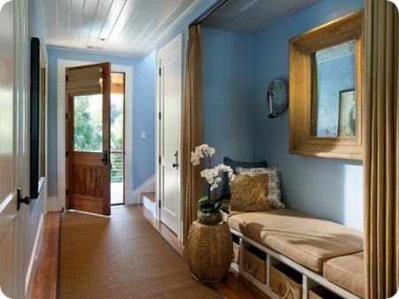
I love that they created a little relaxing nook in the entry here:
I don’t imagine I would lay down for a nap in the foyer, but whatever, it’s cute! ;)
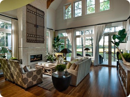
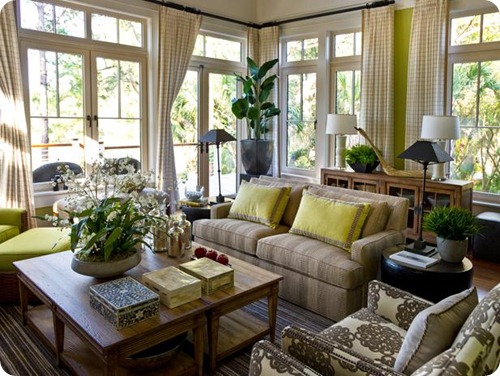
I have mixed thoughts on the family room space:
I LOVE the tall ceilings, all the windows, the floors!
But the fireplace feels out of place to me with the contemporary look and I’m not a fan of the sofa fabric…like, at all:
It just looks so heavy and out of place to me for this room. I expected something a bit lighter. And there is a TON of green in this house. Lots. Some pops of a few more colors would be beautiful!
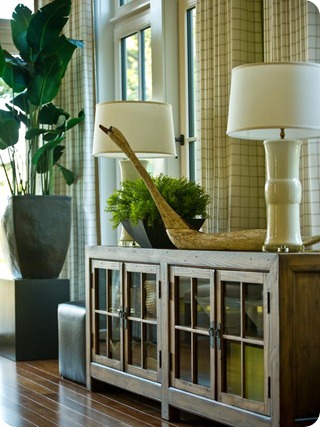
I LOVE this console, with it’s paneled glass doors:
Love the simple accessorizing too – I’m kind of obsessed with that huge crane. Duck?
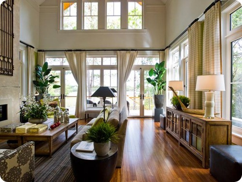
But take a look at this photo – is it me or are there two of those consoles in this pic?:
Am I losing it? There’s one in one pic, two in another right? Oh well, I love them both. ;)
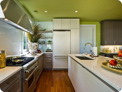
The kitchen I’m not digging as much as some of the other spaces. This house looks like it would have such a lovely, traditional kitchen, and this one leans more modern -- it surprised me (maybe that’s the point!):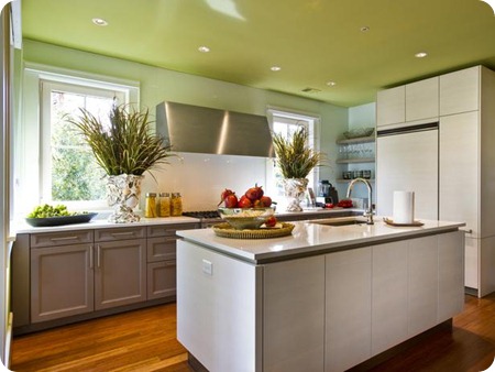
I love the base cabinets, even love the color. And I’m a fan of painted ceilings (I’ve painted most of ours, the blue one in my office is my fave), but that saturated green feels SO heavy to me:
I do love that they used the open shelving in what would be an awkward spot for cabinets next to the fridge!
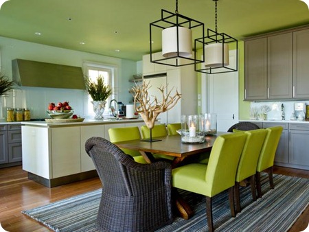
The dining area was more of the same tones – I think a different color for the chairs would be lovely but I love those rattan ones at the ends of the table! I dig the lights too:
Love that rug too!
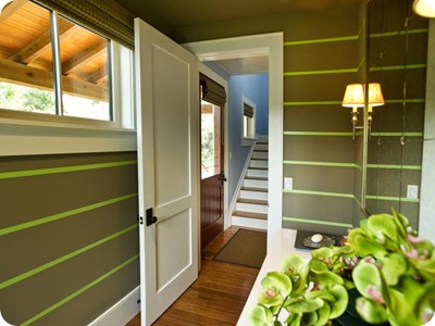
The powder room showcases how the green continues through the house:
I guess I’m just surprised – I expected a bit lighter color palette for a “beachy” type of home like this.
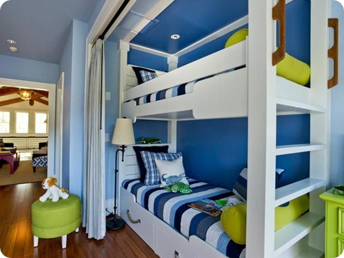
The bunk room was more along the lines of what I expected -- I LOVE the combo of blues and green:
How FUN!
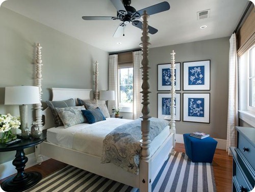
This room was more serene and more monotone:
I wonder if they just put the dining room rug in here for the shot? ;) Although this one looks like it has some more green to it.
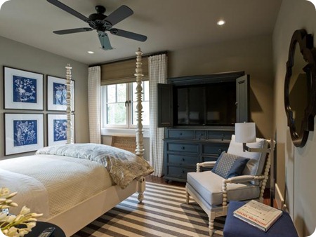
I thought the guest room was just lovely:
The posters on that bed are amazing!
I’m obsessed with that deep blue/grey color on the armoire right now:
It’s similar to what I used on the backs of our built ins.
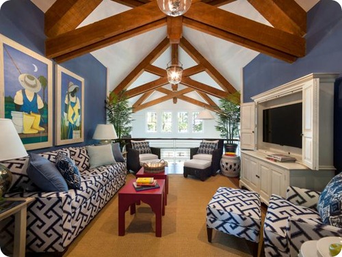
The rafters in the loft are AMAZING:
And I love that deep blue color on the walls!
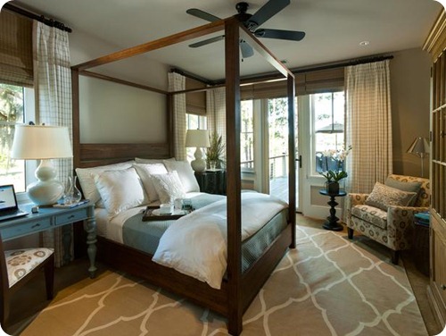
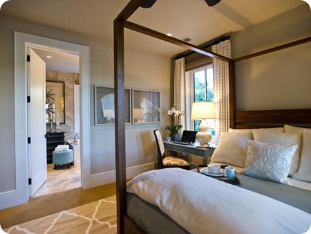
I think my favorite room in the house is the master bedroom:
I’m toying around with replacing our four poster bed and this makes me rethink it.
Love the rug and the pattern on this chair too:
I also like that the two sides of the bed aren’t identical. There’s a small dresser on one side and a desk on the other:
Really love that! This year I’m going to try to to break of out of my need to have everything symmetrical – it hurts me a little but I want to try. :)
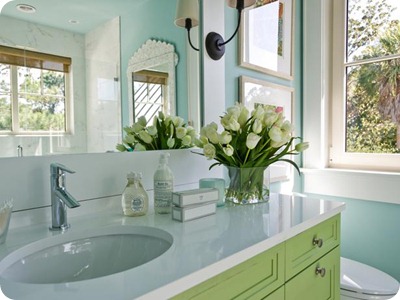
There were a few more little things that I noticed in the house as well. This bright green vanity in a light blue bathroom was one:
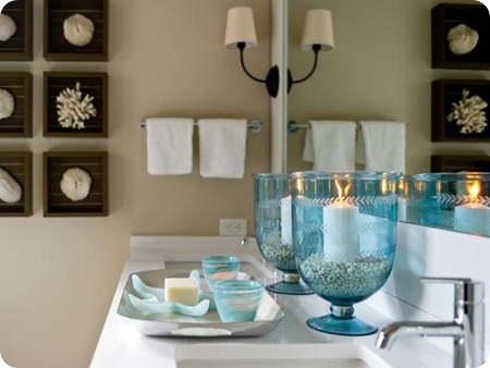
Love that they installed the vanity lights right into the molding around the mirror in that bathroom and this one:
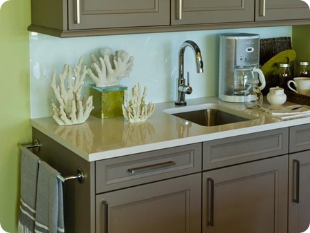
I like the addition of a towel rod at the end of the cabinets in the dining area:
It’s the little things for sure. :)
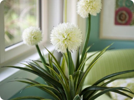
I adore the fluffy blooms on this plant!:
They called it a pandanus – I don’t think I’ve heard of this or seen one before!
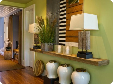
I love that they used a long floating shelf in place of a console or dresser in a hallway:
If you don’t have enough room for a piece of furniture, this would be a great option! My only question would be how do you hide the cords?? ;)
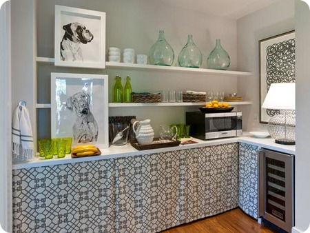
The pantry wasn’t your typical food closet, but I love how they made skirts out of some fun fabric to hide the stuff underneath:
And really? A wine fridge in the pantry wouldn’t suck. ;)
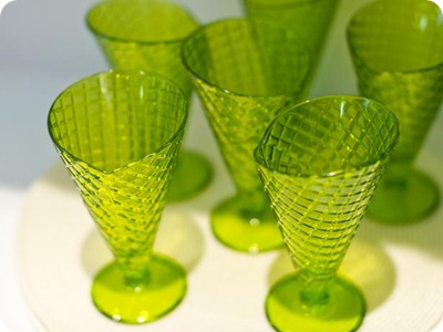
I was so taken with these pretty ice cream cups in there too:
Could be because I could eat a waffle cone for breakfast, lunch and dinner. Could just be cause they’re cute. ;)
What do you think of this year’s dream home? Do you enter every year? I stopped trying a few years back. And then every year when they announce the winner I get a tad excited that maybe it could be me and remember I never entered. Dang. ;)
All photos were taken from the HGTV site here and you can see details about paint colors and the products there too.
**Don’t forget the first Before and After Party of 2013 will be this Monday! I’ll be back to DIY and normal posting next week! Have a great weekend!




Tidak ada komentar:
Posting Komentar