Happy Friday to you all! I’m so sorry for the late post, the Internet is not cooperating today so I’m lucky to even get this one out! This is my third location trying to get wifi – that’s dedication right there. ;)
So many of you have noticed lately that my style, it is a-changin. While I still love the look of a dark, dramatic room (and still have plans for one or two in the house), overall my preference has moved to lighter spaces.
I do struggle with having enough color in a room with lighter walls – I NEED my color. But I’ve had one too many instances where I couldn’t find drapery fabric/bedding/accents that work in a space because the look of the room was so dictated by the color of the (darkish) walls.
I’m realizing that there is great power in a neutral wall. I told you how I couldn’t decide on light or dark for our bedroom, but I made a decision soon after:
Yep. Light won. :) It’s a really light gray color (I can’t remember the name so I’ll have to look and update.)
I went light mostly because I didn’t want the room to become too dark (it already is with the current color). We only have one east facing window in there and I knew it would become a cave if I went any darker on the walls. And it felt like it would be a dark and depressing cave, not a cozy and comfortable cave. :)
But working on the powder room redo really opened my eyes to the decorating possibilities with lighter paint on the walls. I’ve already had plans to lighten up the family room and kitchen, and these inspiration photos kind of sealed the deal for me.
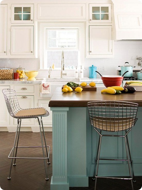
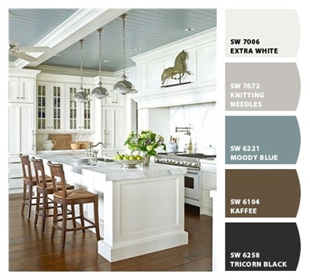
Here’s the thing – I’ve fallen in love with white kitchens over the years too. I drool over them. I love how clean and bright they are, but so color is SO easy to add in:
I painted my kitchen island a similar blue, and I love that you could totally change up the look of the space with just a new color on the island. (And painting an island is WAY easier a whole room.)
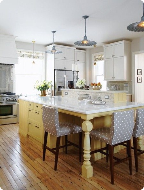
I loved this bright kitchen with the soft yellow island by Sarah Richardson:
That kitchen still feels so warm and comfortable to me, even with all the white.
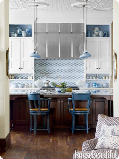
And in a kitchen you can add a ton of color with a backsplash if you wish too:
Of course that’s not an easy change down the road, but you could also add color with the chairs and accessories like this photo.
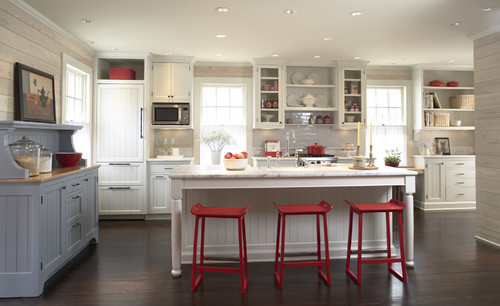
I found this kitchen on Houzz a few days ago and instantly fell in love:
Maybe it’s because I was still feeling the Americana love from the 4th, but I just adore the use of blue and red in there. SO welcoming.
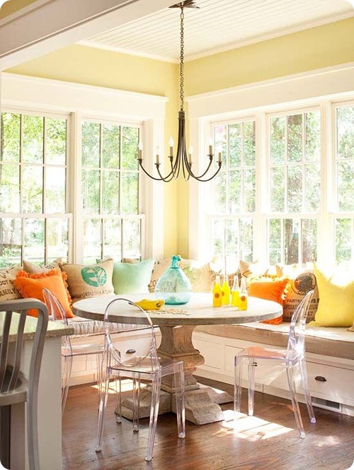
These walls aren’t really neutral, really, but they are light. It just goes to show all the different colors you can bring in:
I’d love a built in banquet like that by the way. Any time is fine.
You know I love a painted ceiling. With darker walls a painted ceiling will feel heavy and could make the space feel dark (I’ve done it and it does both) – but in a lighter room it’s just a beautiful, unexpected accent color:
OK, but seriously, make sure you love that ceiling color. It’s a pain in the patoot to redo. (Again, ask me how I know.)
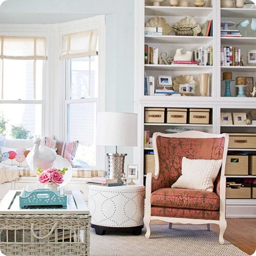
With a lighter wall color the less expensive, easier decorative stuff (like pillows and accessories) can be changed out more often if you wish:
Although I would totally paint the back of those built ins. ;)
Like I said, I have loved our darker bedroom for quite some time, but it’s been SO hard to decorate. The greenish/gray wall color made it difficult to even find accessories that I liked. And bedding? That took FOREVER.
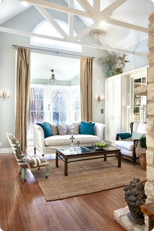
This light gray/blue color is so pretty – there’s not a ton of color in this room but the dark blue pillows totally pop:
I could see a big print on the drapes too – that would be amazing in that space. (Like that room needs my advice.)
In a more neutral room you can do a darker accent wall too – or a really fun wallpaper you wouldn’t normally use on in a whole space:
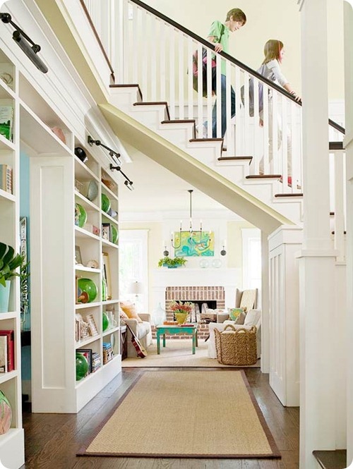
And this photo (which is one of my all time favorite spaces by the way), is a great example of how a lighter space doesn’t always mean stark and bland – the accessories, art and furniture add plenty of texture and color:
All that gorgeous, thick molding sure doesn’t hurt either.
I still don’t think I could do white walls though, do you? Do you have them and love them? I had plenty of white walls in apartments over the years so I don’t think I’ll ever go that far in the light direction.
You’ve probably noticed I’ve gone lighter as time goes on, and I think that will just continue. What do you think? Of course color on the walls doesn’t always mean it will be dark and hard to decorate – I’m just speaking from my experience. Years ago I used a lot of very deep, saturated colors in our house and it was such a struggle to make changes in those rooms. It can be done – it just takes a lot more talent and patience than I have most days. ;)
Are you leaning light these days? Or do you still love your color on the walls and not on your shelves?




Tidak ada komentar:
Posting Komentar