Hey all! I’ve mentioned a few times lately that this time of year makes me nostalgic about our house. We moved in (after having it built) almost exactly nine years ago and my blogging anniversary was in May, so it’s been fun to see our house transform in real life and on the blog throughout the years. :)
One of my favorite transformations in our house is in our kitchen. Years ago I did a few projects that really made a big difference in there, and none of them were hard or expensive. Of course more has changed since then -- it looks SO different to me now!
I thought it would be fun to go back in time and then take a look at how it looks now too. I LOVE before and afters, oh yes!!
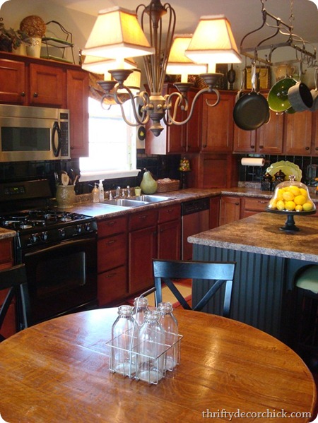
I hand picked everything in this room (well, every room) when we built – I stressed about every aspect of the room, and years later I still like the basics. The problem was it was just SO dark and heavy feeling:
Now don’t get me wrong, I don’t think it was bad – my tastes just changed. I needed to brighten things up in there! The biggest culprit when it came to the dark feeling was the black tiled backsplash.
I tried taking it off, but that was a MESS. So I went to plan B and just covered it all with beadboard. ;)
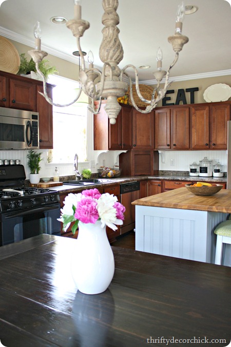
I think it was maybe $60 or something like that? I just glued it on top and it made SUCH a huge difference in there!:
The walls are the same color, obviously the cabinets are too – but that white backsplash really makes a big impact!
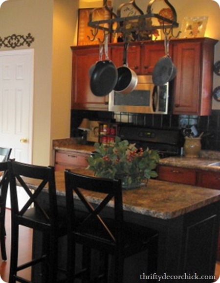
Here’s another shot of the old backsplash on the other side of the room:
By the way, yes the afters are taken with a better camera and the operator (me)knows a little more about photography now, but still – check it out!:
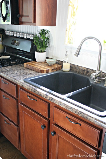
Years ago when I did the backsplash we also changed out the faucet and sink. Little things when you think about a whole kitchen for sure, but they made a big impact.
I love my sink area. It’s nothing fancy, but I have a window and lots of natural light and it makes me happy:
You can read about installing the sink (it was a REALLY FUN TIME) and the name of the sink and faucet in this post.
Here’s another before shot from about three years ago – and seriously, it feels like it’s been ten since the room looked like this. For real, crazy:
Excuse my notes, I was explaining my changes. ;)
Now that same view looks like this:
Have I mentioned I luuuurve my new table? Maybe.
Another little project that made a big impact was the kitchen island. OK, well it wasn’t little – I think it got four redos? Five? Here it is in its builder basic glory:
Awww yeah. Everything matched.
By the way, so many of you ask me about my granite countertops. They’re actually laminate. ;) I may write a whole blog post just about them because I love them that much.
Yes. You heard me.
I love laminate.
Ours is a granite look – you can find similar counters at the Wilsonart site here. Now they make them in a high definition version too and those look even more like granite than ours do. We got an edge on ours that makes them look more like a solid surface too.
But back to the island – as I said, it got a few redos, but after the last one, this is how it ended up and has stayed:
Butcher block on top, beadboard and board and batten on the sides and a lighter color made a huge difference! I love our island and I’ve promised to leave it alone for a while. :)
A few months ago I decided to change up a weird little wall we have in the kitchen and I think it adds a bit of fun and whimsy to the room:
I always say most rooms should have something in black – I think it just grounds a space. A chalkboard wall is the perfect way to accomplish that!
My most recent change in here is in the nook area – here’s how it looked a few years ago:
Again, I’m not going to dog my “old” look and act like I didn’t love it – I did. But it changed with time like the rest of the room (and we took the big blow up pool off the deck too, gah).
Just noticed the high chair too. Sniff. ;)
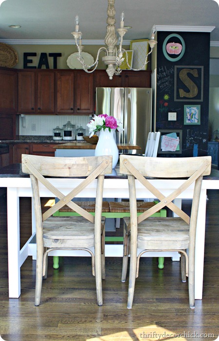
Here it is now with the new light fixture and the DIY farmhouse table:
Oh yeah, and the chairs I had been drooling over for months (just a less expensive version):
So there it is in a nutshell – years of changes in one compact little blog post. ;)
I have been planning BIG changes in here for about two years now, but have wanted to get other projects done first. (Ahem, cough, bathrooms.) I could easily see this kitchen becoming my dream kitchen -- I just need to get a final word on some of the ideas I have (if they are possible), and then I’ll be diving in. I’m still not sure if it will be this year though.
Have you been along for the changes in here all these years? Have your tastes changed a lot over the past five years or so? Blogging kind of encourages mine to happen more than the average person I’m sure, but I do love watching the transformation!
If you have any questions on anything I didn’t mention, ask in the comments! Have a lovely weekend!





Tidak ada komentar:
Posting Komentar