Hello all! I hope you had a lovely Mother’s Day! Mine was just wonderful, I am a lucky woman. So thankful!.
So there are times when I feel like decorating-wise this house is doing OK and over time I feel like it’s coming along nicely. And then there are “those” rooms that harass and taunt me for YEARS.
Our living room, or “front” room, is one of them. We have a very open floor plan, which you think you want and then you get it and realize you have, like, ZERO walls to work with. (And by the way, “you” means “me.”)
So this room is one of those, with only one wall to do anything with. We put a sofa on that big wall when we moved in and it’s stayed just because it fills the space and it’s comfy, even though I (now) really dislike the color.
Years ago (in my everything red and black phase) the room looked like this:
Nothing wrong with it, just not my style anymore. And I had always wanted to kind of pull things in more to make it more cozy.
I didn’t really accomplish that in the next phase, but I did start lightening things up:
See the pink walls? Yeah. Eight years I lived with those! I deserve a gold star. I’ll take a cookie!
The dresser didn’t last too long there – I found a small bookcase at HomeGoods that put in that spot instead, and I really liked how it fit right between the windows:
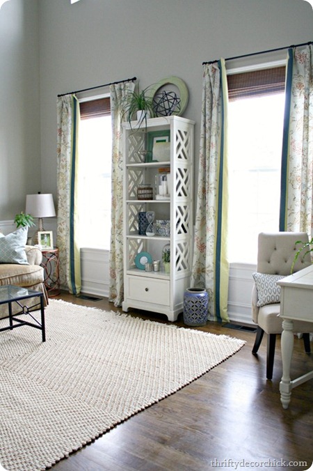
But I noticed something when I moved that bookcase at Christmas last year – I really liked it in the new spot (I scooched it over by the sofa). And then I put it back and every time I looked at it just felt really busy in that spot:
I’ve been planning to tone down the accessories on there for awhile, but it’s more than that. The drapes have a lot going on and combined with the shelves and all the stuff on them, it was just bugging me. So for months now I’ve been thinking I need to try scooching it again – and I got a wild hair this weekend and finally did it.
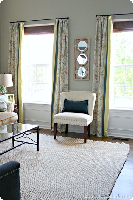
All I did was move the bookcase back to the “Christmas” spot and then put the chair over there:
The mirror was another HomeGoods find I’ve had for months – it was one of those rare finds I didn’t really have a spot for but knew I couldn’t pass up. I love it between the windows!
It just feels like that room can breath better now, you know? That silly spot between those two windows has been one of the hardest spot for me all these years! Such a goofy thing, but it’s driven me batty!
I can’t even decide if I want the chair turned in towards the sofa (like above) or facing out to the room:
First world problems here people.
There are still plenty of things that bug me about the room – it’s got two story windows and I love all the light (we need it in there) but it makes for a hard space to decorate. And with the one lone wall (without windows) and two honkin’ pillars in there, there are not many furniture layout options.
But I do love this small change! It just feels less busy and simpler to me. Here’s a different view of that spot last year with the pink(ish) walls and the bookcase:
And here it is with grayish walls and a simpler look now:
It didn’t cost any money, which is a bonus (most of my changes to that spot haven’t, thank goodness), and after staring at it for months it took all of ten minutes to move the bookcase and hang the mirror.
For now…I love it! ;) For. NOW.
Do you have a room/spot/wall between two windows that drives you fruit loopy? Do you change it with the wind like me? Or have you found a solution that finally works?


Tidak ada komentar:
Posting Komentar